

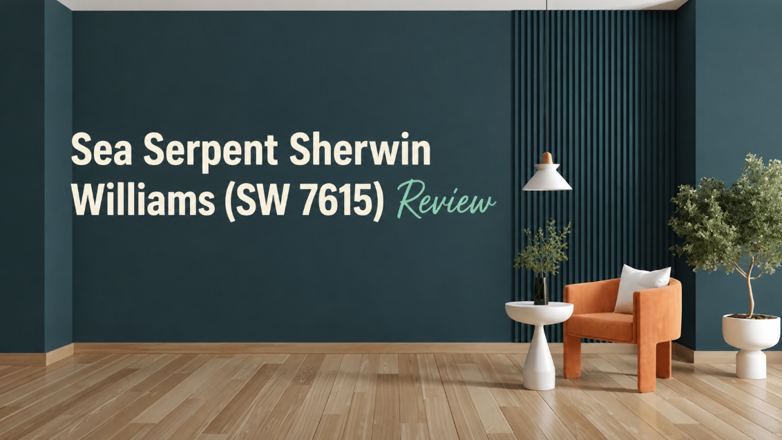
If you’ve been circling dark paint colors and keep landing back on the same one, there’s a reason. Sea Serpent Sherwin Williams (SW 7615) has a grip on the interior design world right now — and it’s not just because it photographs well. This deep blue-green has a specific kind of personality: calm without being cold, moody without feeling heavy.
This review covers what Sea Serpent actually looks like across real lighting conditions, which rooms it handles best, what to pair it with, and the one situation where you probably shouldn’t use it. No filler, no cheerleading — just what you need before you buy a gallon.
What Is sea serpent sherwin williams (sw 7615)?
Sea Serpent Sherwin Williams (SW 7615) sits in the deep navy-to-teal range with green undertones that surface depending on the light. It’s not a straightforward navy, and it’s not teal either — it lives in the space between.
| Spec | Detail |
| Color Code | SW 7615 |
| LRV | 7 |
| Undertones | Blue-green, subtle gray |
| Color Family | Deep Neutrals |
| Finish Options | Flat, Eggshell, Satin, Semi-Gloss |
| RGB (approx.) | R: 43, G: 60, B: 66 |
LRV of 7 means this color absorbs roughly 93% of light. That matters a lot in practice. In a bright, south-facing room it reads as a rich dark teal. In a north-facing room, the blue deepens and the green pulls back. Neither version is wrong — they’re just different moods.
Where Sea Serpent Works (and Where It Doesn’t)
Best Rooms for SW 7615
Living rooms and dining rooms are where this color shines most. All four walls in a dining room with Sea Serpent creates the kind of atmosphere that makes dinner parties feel like an event. It doesn’t overwhelm — it frames.
Home offices benefit from it too. There’s something about a dark, composed backdrop that helps with focus. Pair it with warm task lighting and a light desk surface, and the room feels deliberate without being severe.
Exterior use is where Sea Serpent surprises people. On a front door or shutters against white trim, it reads as a sophisticated alternative to classic navy — just distinct enough to stand out.
When to Skip It
Small bathrooms with no natural light. The LRV of 7 doesn’t leave much room for light to bounce, and a windowless powder room can start to feel like a ship cabin. If you love the color, use it on a single accent wall or vanity instead.
How Sea Serpent Behaves in Different Light
| Light Condition | How SW 7615 Reads |
| Morning (east-facing) | Cooler, more blue — crisp and sharp |
| Afternoon (south/west) | Green undertones emerge, warmer feel |
| Evening (incandescent/warm LED) | Deeper, moodier — the green mostly disappears |
| North-facing (all day) | Consistently blue-leaning, never warm |
| Overcast natural light | Flat but rich — the true neutral version |
The color is most complex in afternoon light. That’s when the blue and green genuinely pull at each other, and the wall stops looking like a single flat color.
Best Colors to Pair with Sea Serpent Sherwin Williams
The pairings that work best all share one thing: they either contrast it hard or complement its temperature.
Trim and Ceilings:
- Alabaster (SW 7008) — creamy white that softens the contrast without going stark
- Pure White (SW 7005) — crisper, more modern look; great for contemporary spaces
- Extra White (SW 7006) — the sharpest contrast option; makes architectural details pop
Accent Colors:
- Warm brass and unlacquered bronze fixtures pull out the warm undertones
- Soft terracotta or dusty coral in textiles creates contrast without fighting the wall
- First Star (SW 7646) is one of the cleaner light neutrals that holds its own against Sea Serpent without washing out
Materials that work:
- Light oak and maple furniture — the warmth offsets the cool wall
- Walnut in smaller doses adds richness without going dark-on-dark
- Marble with warm veining (not stark white) reads beautifully against it
What to avoid: Bright cool grays and stark blue-toned whites. They flatten Sea Serpent’s complexity and make the room feel cold rather than composed.
How Sea Serpent Compares to Similar Colors
People often shortlist Sea Serpent alongside other deep blue-greens. Here’s how they differ:
| Color | Key Difference |
| Naval SW 6244 | Stronger blue, less green — more classic navy |
| Salty Dog SW 9177 | Similar depth, but greener and more teal |
| Hunter Green | Earthier, warmer — reads more forest than ocean |
| Anchors Aweigh SW 7080 | Lighter LRV (12), softer and more versatile in small spaces |
If you want something that sits exactly between ocean and forest, Sea Serpent is the one. Naval goes too blue; hunter green goes too warm.
Finish Recommendations
| Room | Recommended Finish | Why |
| Living room | Eggshell | Low sheen, easy touch-ups |
| Dining room | Eggshell or Satin | Slight sheen handles humidity and scuffs |
| Kitchen island | Satin | Stands up to cleaning |
| Bedroom | Flat or Eggshell | Truest color, minimal light bounce |
| Exterior (doors) | Gloss | Durability and visual punch |
Frequently Asked Questions
What is the LRV of sea serpent sherwin williams (sw 7615)? Sea Serpent SW 7615 has an LRV of 7, which means it reflects only 7% of light. It’s a very dark color that absorbs most light in a room.
Does Sea Serpent look more blue or green? In most lighting, it reads as a dark blue-green. Blue tends to dominate in north-facing or low-light rooms. Green undertones come through in warm afternoon light or with incandescent lighting.
What trim color goes with Sea Serpent? Alabaster SW 7008 and Pure White SW 7005 are the most common choices. Alabaster softens the contrast; Pure White sharpens it. Both work — it depends on whether you want the room to feel cozy or clean.
Can Sea Serpent be used on exterior walls? Yes, though it’s most popular on front doors, shutters, and exterior trim. Full exterior walls in SW 7615 work best on homes with lighter siding as the contrast element.
How many coats does Sea Serpent need? Two coats over a gray-tinted primer is standard for full, even coverage. Going straight over white walls may require a third coat to eliminate patchiness.
sea serpent sherwin williams (sw 7615) earns its popularity. It’s specific enough to feel like a real design choice, but flexible enough to work across modern, coastal, and traditional interiors. Test it with actual sample boards (not chips) in your specific light before committing — and if it keeps looking right, trust that.